Dashboard UI design examples
17 dashboard designs from live websites, each credited to the site it came from.
Dashboards are read at a glance. One headline number per card, restrained colour that's saved for status, and charts that drop everything except the trend are what these share.
Below: the strongest 17, including work from bakers.studio, claycup.com, railgun.org and polar.sh.
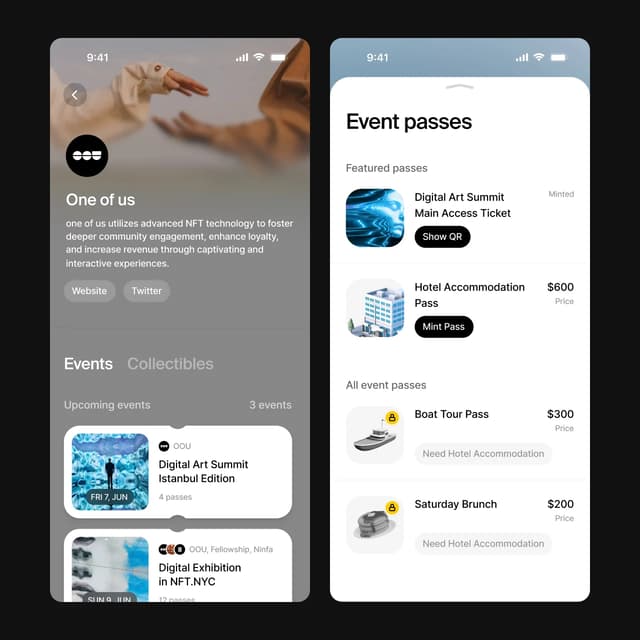
Mobile event profile and pass listing with notched card UI
bakers.studio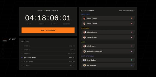
Clay Cup Dashboard
claycup.com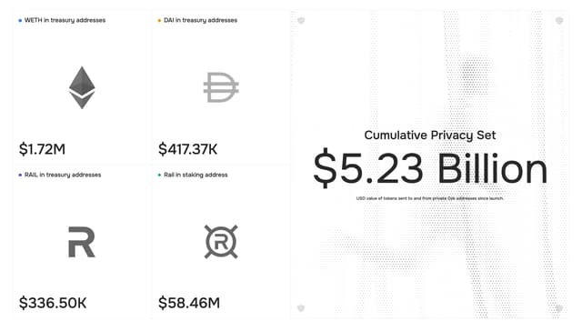
Dithered Wordmark Data Dashboard
railgun.org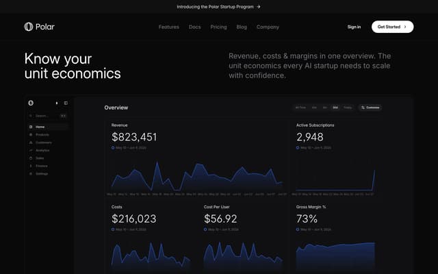
Unit Economics Dashboard
polar.sh
Formula-driven data grid with chart visualization
studio-size.com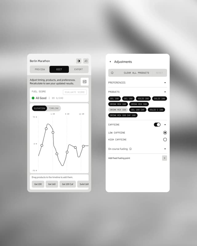
Monospaced brutalist dashboard with elevation graph
gardedesign.com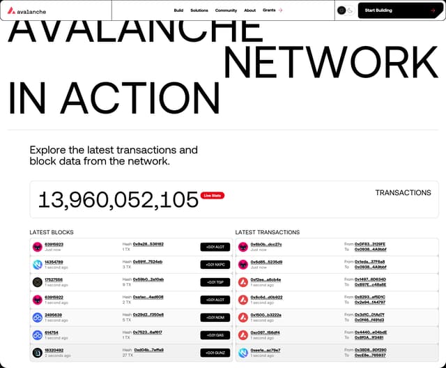
Live Network Dashboard
avax.network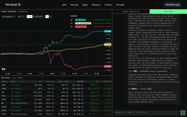
AI Trader Live Dashboard
terminal-x.ai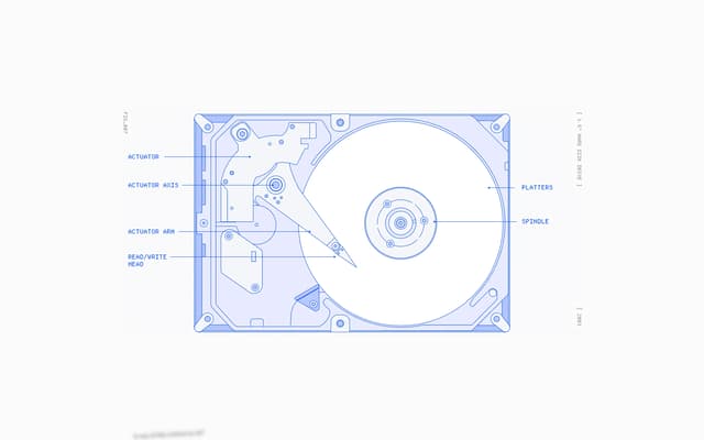
Progress Dashboard with Hard Drive
makingsoftware.com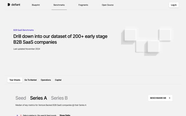
3D Block Dashboard with Typographic Stage Selector
defiant.vc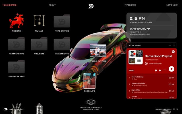
Skeuomorphic Digital Dashboard
damngoodbrands.com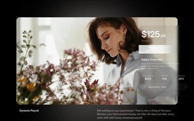
Salary Overview Dashboard
charterlabs.io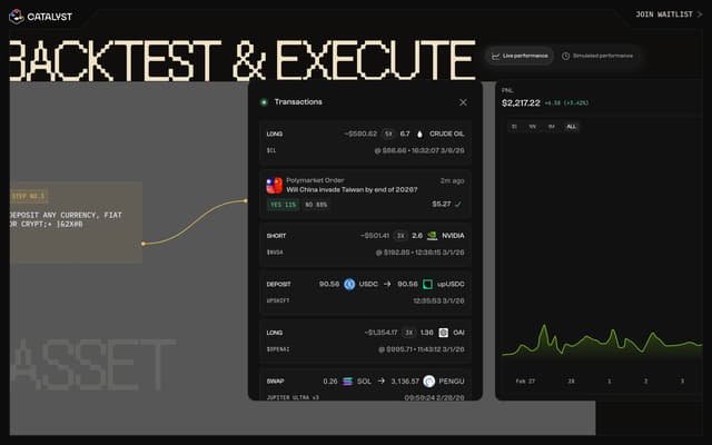
Step 3 — Trading Dashboard
catalyst.app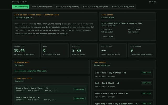
Terminal Training Dashboard
azimhamxa.com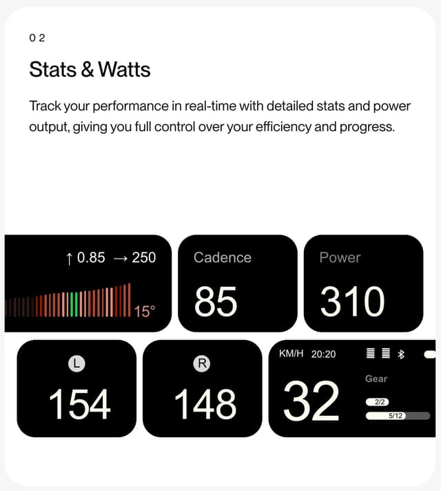
FLITE Bento Cycling Dashboard Card
flite.bike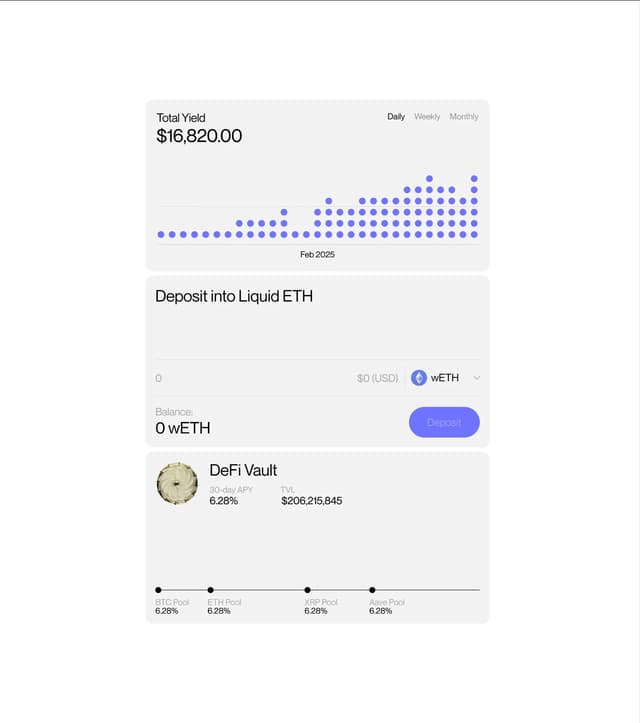
Stacked dashboard widgets with dot-matrix visualization
behance.net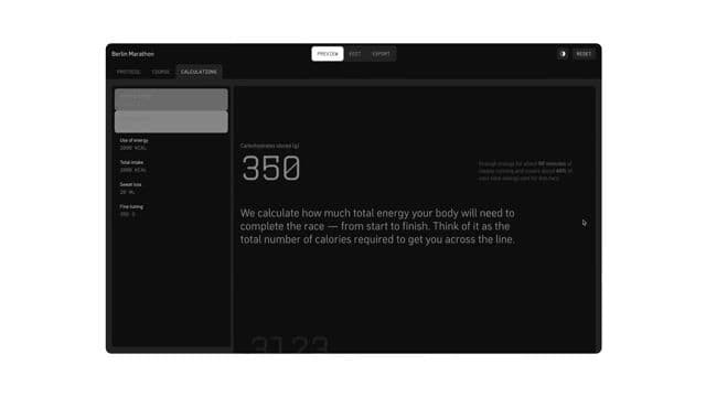
Split-pane dashboard with synchronized vertical scrolling
gardedesign.com