Bento grid examples
224 bento grid layouts, mostly from live websites, each credited to its source.
A bento grid fits several ideas on one screen in tiles of different sizes, with the size of each tile saying how much it matters. Look at where the biggest tile goes and how much each small one says.
- Try
The highest rated of 224 from 16 different sites, including timeless.co, emmaportner.com, lobao.work and i-mad.com.
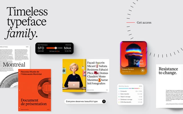
Timeless Type — Bento Grid Specimen Page
timeless.co
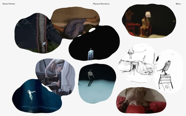
Organic Blob Grid Gallery
emmaportner.com
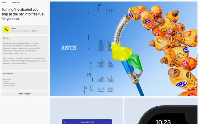
Justos Carnival Hero
lobao.work
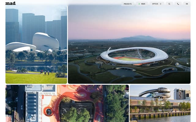
Asymmetric Bento Portfolio Grid
i-mad.com

Split hero with bento widget grid and overlapping typography
pxdx.pl
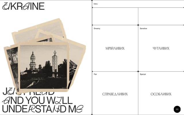
Swiss Grid with Cyrillic Labels
themessagetoukraine.obys.agency
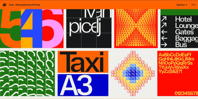
High-Contrast Typographic Bento Grid
exat.hottype.co
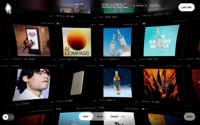
3D Warped Bento Grid Hero
phantom.land
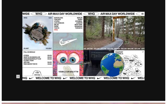
Nike Bento Grid Showcase
ogginok.studio
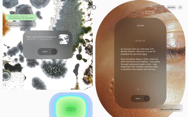
Organic Bento Grid Layout
oem.care
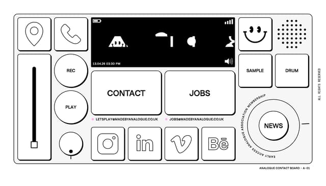
Skeuomorphic Contact Board Bento Grid
madebyanalogue.co.uk
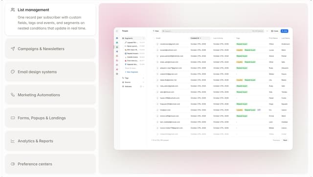
Bento Feature List with Live Preview
audienceful.com
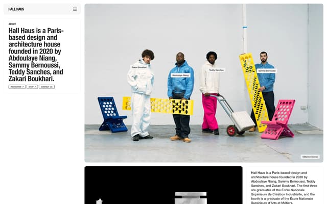
Bento Grid About Page
hall.haus
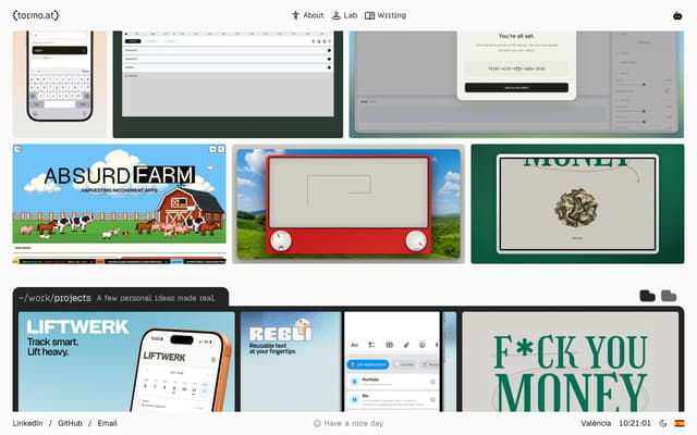
Bento Grid with Terminal Separator
tormo.at
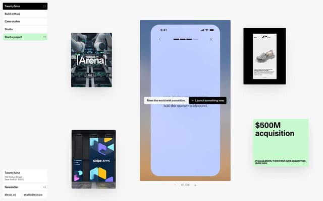
Bento Grid Springboard
xxix.co
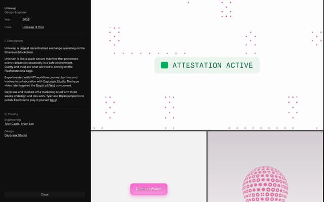
Bento-Grid Case Study Layout
willphan.com
208 more bento grid layouts
Describe what you're after and the library finds it, by look or by what it does. Save the ones you want to a board, then hand the board to your AI tools when it's time to build.
Search all 224 bento grid layoutsNo card needed to create an account.
Questions
What is a bento grid in web design?
A layout of rounded or ruled tiles in mixed sizes, named after the compartments of a bento box. It lets a page show several features at a glance, and product and portfolio sites use it most.
What are good examples of bento grid layouts?
Three of the highest rated in the library: Timeless Type — Bento Grid Specimen Page (timeless.co); Organic Blob Grid Gallery (emmaportner.com); Justos Carnival Hero (lobao.work). The rest of this page shows more, each credited to its source.
Where can I find more bento grid layouts?
This page shows 16 of the 224, chosen from different sites. The rest are in the save.design library. An account lets you open them, search by what they look like or do, and save them to a board. Search shows a preview of the results until you're on Individual, at $12 a month or $10 billed yearly, which has the whole library.
Are these from real websites?
Almost all of them. Most were captured from a live site and credited to it, and a few come from posts on social networks such as Instagram, credited to the network. With an account, you can open one to see it in full, along with similar elements and a link to its source.
Check any site with the website analyzer in a save.design account, where a new account includes 10 analyses. Save what you like to a board, then hand it to Claude, Cursor or your other AI tools over MCP when it's time to build.