Minimalist website design examples
976 minimalist website sections, mostly from live websites, each credited to its source.
Minimal sites have nowhere to hide, so spacing and type do all the work. Look at how few sizes and colors each one uses, and at what it leaves out without making anything harder to find.
- Try
The highest rated of 976 from 16 different sites, including adamho.com, leoparpeix.com, ramp.design and drinkesther.com.
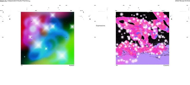
2022 Recap Project Grid
adamho.com
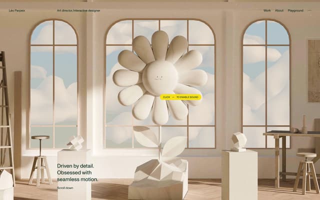
3D WebGL Studio Hero
leoparpeix.com
- 0:08
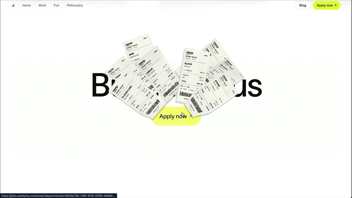
Minimal hero with cursor-following 3D receipt gun animation
ramp.design
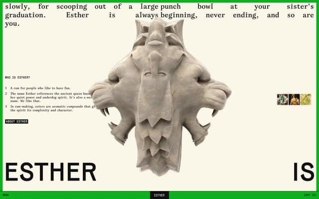
Brand identity about row
drinkesther.com

HUD Overlay with Live Data
yutaabe.com
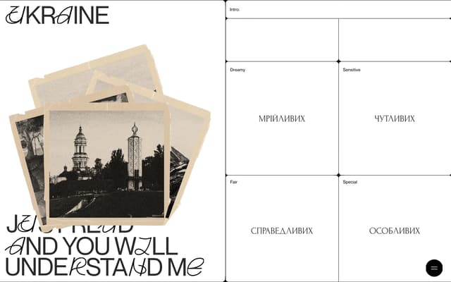
Swiss Grid with Cyrillic Labels
themessagetoukraine.obys.agency
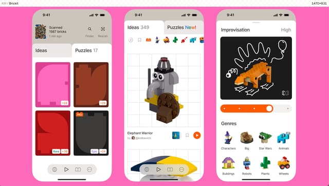
Mobile app gallery with 3D asset integration
medvedev.xyz
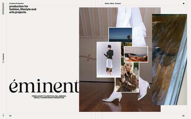
Editorial Hero with Image Collage
eminente.art
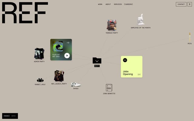
Careers Page with Brutalist Layout
ref.digital
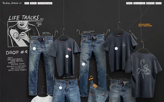
Clothesline Campaign with Chalk Type
nudiejeans.com
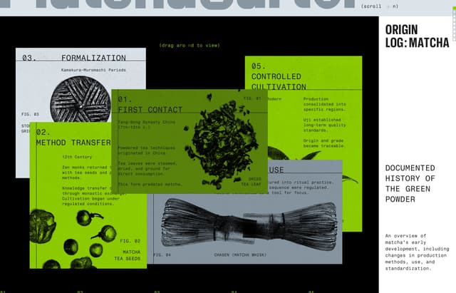
Controlled Cultivation Section
matcha-cartel.com
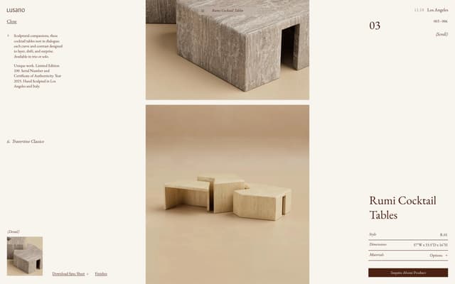
Lusano Product Specs & Narrative
lusano.com
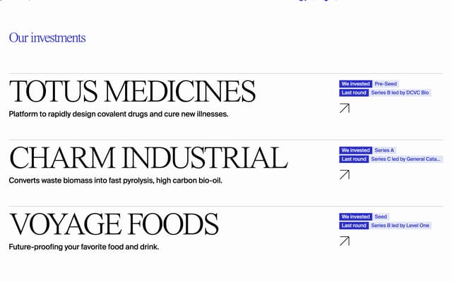
Editorial Investment Portfolio Header
social-impact-capital.com
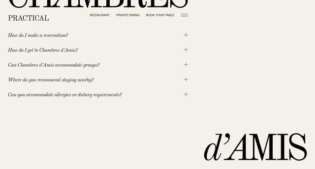
Editorial FAQ section
chambresdamis.be
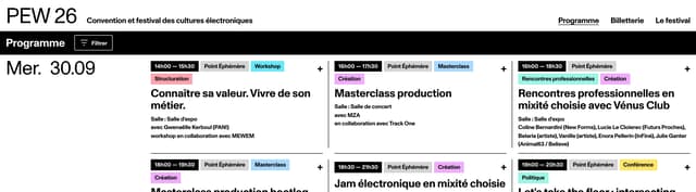
Programme Filter Bar
pariselectronicweek.com
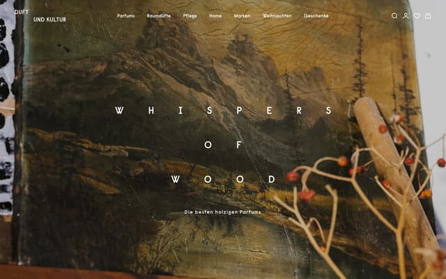
Editorial Hero: Whispers of Wood
duftundkultur.com
960 more minimalist website sections
Describe what you're after and the library finds it, by look or by what it does. Save the ones you want to a board, then hand the board to your AI tools when it's time to build.
Search all 976 minimalist website sectionsNo card needed to create an account.
Questions
What makes a website minimalist?
It uses few colors, few type sizes and a lot of space, so each remaining element carries more weight. Good minimal sites still make the next step obvious. The removal serves the reader rather than the look.
What are good examples of minimalist website sections?
Three of the highest rated in the library: 2022 Recap Project Grid (adamho.com); 3D WebGL Studio Hero (leoparpeix.com); Minimal hero with cursor-following 3D receipt gun animation (ramp.design). The rest of this page shows more, each credited to its source.
Where can I find more minimalist website sections?
This page shows 16 of the 976, chosen from different sites. The rest are in the save.design library. An account lets you open them, search by what they look like or do, and save them to a board. Search shows a preview of the results until you're on Individual, at $12 a month or $10 billed yearly, which has the whole library.
Are these from real websites?
Almost all of them. Most were captured from a live site and credited to it, and a few come from posts on social networks such as Instagram, credited to the network. With an account, you can open one to see it in full, along with similar elements and a link to its source.
Check any site with the website analyzer in a save.design account, where a new account includes 10 analyses. Save what you like to a board, then hand it to Claude, Cursor or your other AI tools over MCP when it's time to build.